You know you have an amazing family when...
10/09/17 10:16 Filed in: Ideas

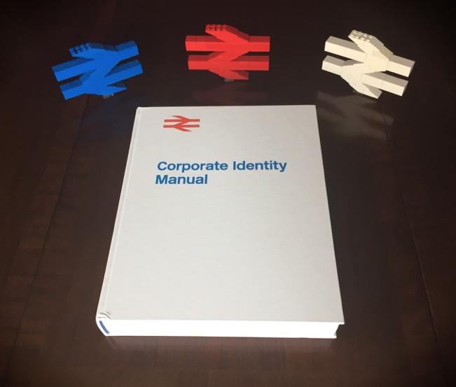
A couple of weeks ago, I finally received my birthday present in the post from my wife: a gorgeous reprint of the British Rail Corporate Identity Manual.
On my birthday itself, my eldest son presented me with brick-built BR double arrow logos! I can't believe that I hadn't thought of making them myself. In any case, I doubt I could do better than his brilliant builds. I think he perfectly captured their size and proportion in an elegant and clean stud-ups design.
The BR identity manual is a feast for the eyes, especially for train and graphic design geeks such as myself. Its lovely to see many similar identity manuals of this era being re-issued through the magic of crowd funding projects. Examples include the NYC subway, the EPA, IBM, and other public and private sector agency identity manuals being lovingly reproduced for posterity. Its a pity that the same care and attention to quality public branding and imagery is not often found these days. Not every logo or brand needs to become a design icon; however, it would be nice to simply avoid the garish self-indulgence of the latest trendy design fads (I'm looking at you Xerox and others who embraced trendy 3D-swooshy logos!)
I couldn't have asked for better presents as these. Sometimes love can be expressed in the purity of a logo! (and not necessarily a heart-shaped one!)